Step by step guide
Below is a more in depth break down of each step, start to finish.
Follow each step carefully and if you like, share your results with me on instagram - @Henboydesigns
Click the image to open in new tab >>>>
Centre and Section
1. Centre line
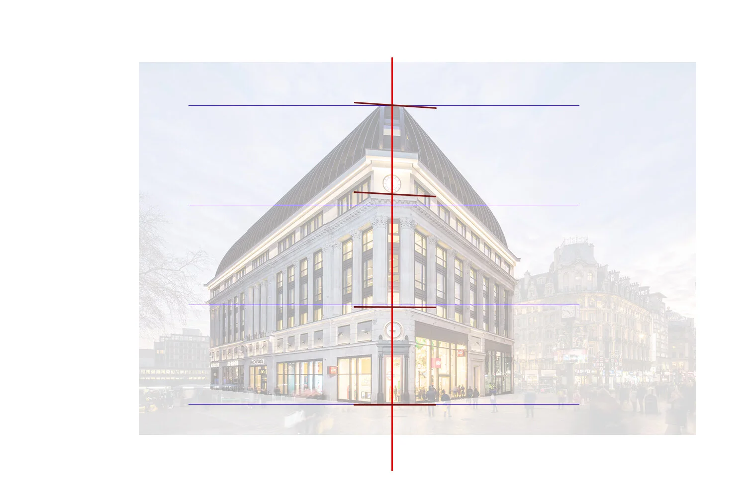
To start off, draw a line down the middle of the page, this will be the centre of the building. Then add a line for the top and bottom of the building.
2. Thirds
When looking at the subject, we can easily see a way to divide it into smaller segments using the floors 1, 2 and 3. Mark lines that divide the height into three parts. (See tip below)
3. Subject Dividing
Once we have three equal sections, we can add a greater level of accuracy by marking certain parts of the subject. We can see the 2nd floor is slightly larger than the top floor.
Tip - Pencil measuring
Your pencil is a great tool for creating perfect proportions. Estimate one third of the height on your pencil and gently mark each segment. Adjust them after if needed as you may over or under estimate at first.
To the right, you can see i’ve added two extra lines either side of the centre as the corner is chamfered. This will help for the perspective.
Perpsective
The perspective is the art of representing three-dimensional objects on a two-dimensional surface so as to give the right impression of their height, width, depth, and position in relation to each other. Larger and closer objects have more perspective, smaller and distant objects have less.
4. First Perspective
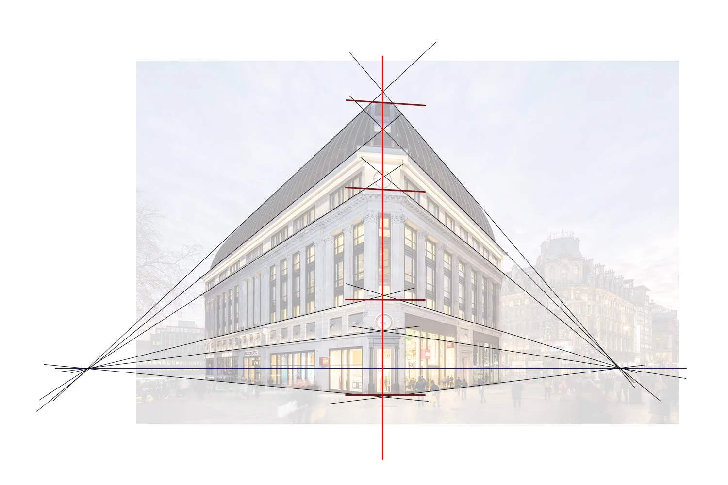
Now we can add the first perspective lines, you can chose either side to start. Look at the angles of the building and estimate where the line should go, this may take a few tries to get right. Where the two line meet will be your vanishing point.
5. Horizon Line
From the first vanishing point we can extract the horizon line, the blue line. This line should be parallel to the bottom of the page (see tip below) and cross through the intersection of the perspective lines. We can see in this building, the horizon goes through the door.
6. Second Perspective
Now add the other side of the perspective. Again, they should meet at the horizon line. Also notice that one side has a sharper angle than the other, this means the intersection will be closer to the centre of the subject.
Tip - Straight lines
If you’re with struggling with straight lines, theres a few tricks that can help. You can hold the paper up to your eye and look down the line to see how straight it is and see where it went wrong. Another method is to lock your hand to the edge of the paper and slide it along. This will give you a perfect parallel line to the page, great for the horizon line.
Guidlines
7. Extra Perspectives
Once the main perspectives are in place we can add some more to help divide it even further. Look for obvious breaks in the subject. You can add as much as you feel necessary, the more you add, the more guidance there is for later.
8. Side edges
Now we need to add the perimeter edges, we need to make sure this is correct to the height so that everything is in proportion. As before we can use the pencil for guidance. (See tip below)
9. Segmenting
Let’s go even further in separating the subject into sizeable chunks. Above, you can see I’ve divided each wall by how many windows there are. Don’t forget perspective still matters here, the windows at the front have more space than the windows at the back.
Tip - Proportioning
This tip will help to make sure everything is in proportion to each other. On the left you can see i’ve used my pencil to measure the first two thirds from the bottom up. I then find a distance from the edge that is the same length. In this example it is from the centre line, second line up, following the perspective down. That means that the edge is where my pencil ends, so mark that spot.
The same can be done for the right side, this time we measure the middle third, then go from the centre, to the right, which will give us the that edge.
This method can be used in many ways for all types of drawings, the better you keep your drawings in proportion, the more convincing the outcome will be.
Outlining
10. Adding shapes
You should now have something that looks similar to the example above. You have the outline of the subject and have divided it into smaller more manageable chunks. Now try adding some more shapes to the sketch.
11. Aim for accuracy
You don’t need to go into lots of detail yet, remember these pencil marks are just guidance for the pen later on. Outline the windows and doors and any other objects. Just aim for accuracy, don’t be afraid of using a rubber.
12. Outlining
Once you have all the pencil marks in, you can start to trace over them in pen. Be very gentle at first and avoid making any hard lines yet, we may still want to tweak them. Think about which line you are drawing, is it the inside or outside of the window frame?
Tip - Hand Positioning
Your hand should never be in an uncomfortable position. If you’re drawing a long straight line, try moving the paper to fit in line with your hand, rather than the other way round. This will minimise errors and keep your pen going where you want it. You can see my hand looks exactly the same in both pictures.
Detailing
13. Detailing
Now that you’ve traced your pencil marks you can rub them out to leave the shell of the pen. They should be light pen marks that give an overall size of each part and section. If you like, you can use the pencil again for further details before going over in pen once more.
14. Detailing
Let’s put in some details, this is the part that can become very tedious so make sure to take some breaks in-between. You can add as much or as little details as you like. The more details you add, the more refined the illustration will become.
15. Always reference
You should be looking back and fourth between the photo and drawing every few seconds for reference. Every line has its place and its reason for being there.
Tip - Line weight
Using different line weights is a great way to show types of edges in a drawing, plus it makes the outcome more dynamic. The top weight may be used for the outline of the whole subject, while the bottom two may be used for showing brickwork or soft corners. You can always go over lines later, so better to start soft.
Shading
16. Shading types
The image above shows different ways of making light and dark areas. You can choose one type or a combination, this is the part that can define your unique style. Look how the different variables affect what we see. Line thickness, line density and line volume are a few ways we can create darker parts.
17. Looking for light
Make sure you know where the light is coming from for each shadow. Here, we can see there is a shadow cast under the roof that sticks out forward. You also need to find the darkest parts and make sure they are suitable black. You need to produce contrast to make your drawing stand out.
18. Refining edges
Once all the shaded parts are filled in and the darkest areas are complete, go over your drawing and refine some of the edges. This means straightening wobbly lines or thickening areas where you think it is needed. You want nice sharp edges.
Tip - Shadows
If you are drawing something of your own and you’re struggling to visualise the shadows, take a rectangular object and place it under a sharp light. Move it around and see how the shadows are created underneath it. Have a go at some shading exercises, like this cube on the right, before you start on your drawing.
19. Finishing touches
Here is my finished version. It’s not perfect, there are a lot of hidden mistakes but you don’t notice them once all the details are in place. The most important thing when starting out is getting all the proportions and perspectives correct.
You can see in my illustration I’ve added some extra details such a faint street path, people and a couple distant buildings that fall behind the subject. This helps to give the subject scale and makes the overall finish more interesting.
I hope you enjoyed taking this short tutorial and I would love to see how your illustration turned out, so don’t forget to tag me @Henboydesigns, if you post it on instagram.
Brickwork
If your subject has bricks, then adding in the details of them is a great way to add character to the illustration. You can choose to add all or just a little of the details, each style has its own aesthetic perception.
Windows
If your subject has glass, then there are a number of ways you can draw it. It’s good to try and show where the glass is, as it can add a lot character to the illustration. You can also show any reflection you can see.
Textures
Another way to make your illustration more interesting is to recognise any material textures. Try to simplify what you see and represent the main aspects of it. You can exaggerate it slightly for bigger impact.


